OrbitEd ༄˖°.🪐.ೃ࿔*:・
Role: Web Development Lead and UX Designer
Medium: JS/HTML/CSS, Figma, AdobeXD
Hours spent: 8
Team members: 4
Project context: Women in Informatics 12th Annual Hackathon
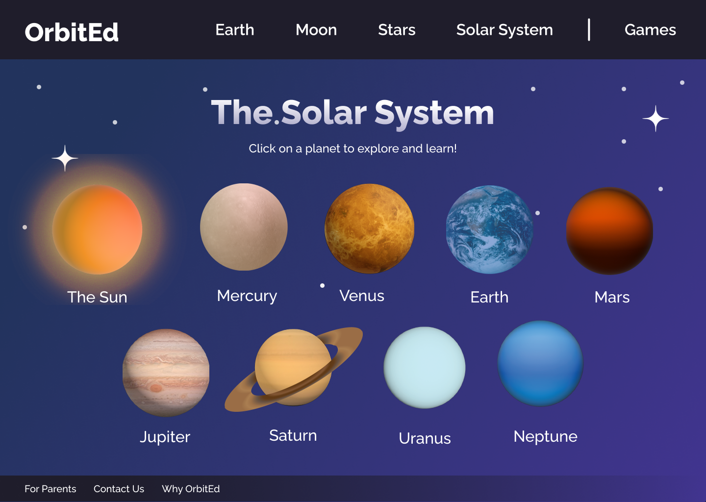
OrbitEd is an interactive educational website designed to teach middle school students about planetary science through exploration and play. We created OrbitEd during the 2024 Women in Informatics (WINFO) Hackathon, developing both a polished Figma prototype and a functional HTML/JS site. Our team reached the finals with this accessible, game-based approach to science education.
ᯓ★ Demo Video ᯓ★
🎯 My Role
As the Web Development Lead and UI/UX Designer, I wore several hats throughout the sprint:
UI/UX Design: Shaped interaction patterns, quiz flows, and visual layouts in Figma to support a smooth learning experience for younger audiences.
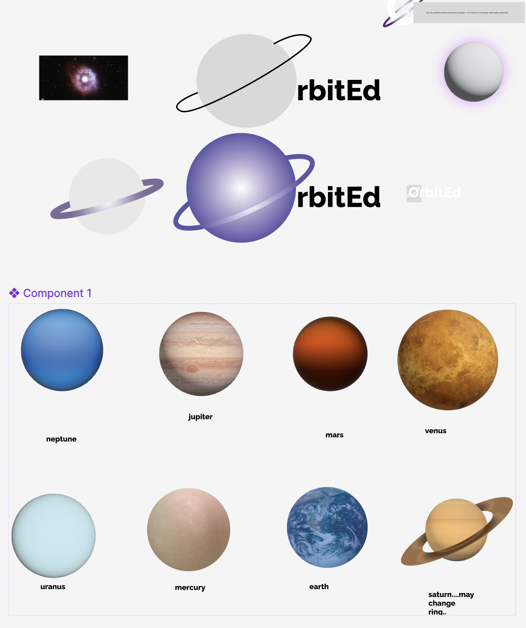
Visual Asset Creation: I helped support mocking up planet icons and space-themed visuals in Adobe XD and Figma, emphasizing aesthetics, scale, and visual differentiation.
User Research & Personas: Used research collected by team to create user personas, grounding the product in realistic use cases.
Mini-Game Development: Coded a small working quiz in HTML/CSS/JS to demonstrate how key mechanics would feel in-browser.
Presentation Support: Helped structure and present our project to judges, focusing on usability and educational relevance.

Sites/interfaces we took inspiration from ↑
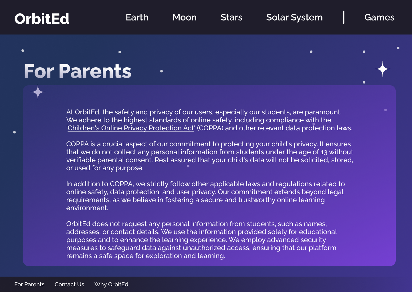
📚 Addressing the Education Gap
During our user research and interviews, we identified a clear gap in accessible, engaging planetary science resources tailored specifically for middle school students. Many existing tools were either too technical or too simplistic, leaving students either overwhelmed or uninterested.
Teachers and homeschooling parents shared that finding content which balances factual accuracy with interactive learning is challenging. Students often struggled to connect textbook concepts with real-world understanding, especially without hands-on or visual experiences.
OrbitEd was designed to bridge this gap by providing:
Age-appropriate, interactive content that encourages exploration at each student’s own pace
Visual storytelling to make abstract concepts tangible and memorable
Engagement through mini-games and quizzes that reinforce learning without pressure
A flexible tool usable in classrooms or at home, supporting diverse learning environments
❓ The Key Question: How can we create an engaging, accessible digital experience that helps middle school students learn planetary science effectively, while keeping the content fun and motivating enough to inspire curiosity beyond the classroom?
🚀 Design Process
🔍 User Research
We conducted informal interviews with five people across our target audience: teachers, students, and a homeschooling parent. This helped us identify what information styles and game mechanics would best support our audience’s needs.
👥 Personas
Based on the interviews, we developed three personas:
Jonas (Student) – Jonas is a 6th grader who is currently being homeschooled. Jonas has a hard time focusing when visiting the existing sites for planetary education due to their lack of visually appealing and interactive features. He considers himself a text and image-based learner, and being able to retain information is easier for him when he is able to quiz himself in fun and engaging ways.
Casey (Science Teacher) – Casey is a 6th grade teacher. They are trying to provide new and exciting ways for their students to engage with the material on planetary sciences. Casey feels that their students have a hard time being interested in the current curriculum. They want to create an environment that makes learning constructive and interesting
Denise (Homeschool Mom) – Denise is a mom of two kids that are nearing 6th grade. One is homeschooled and one is not. Denise wants to figure out a way to invite both of her children to be curious about the information that they are learning at home and in a school setting.
These personas directly influenced the tone of content, color choices, layout simplicity, and feedback design.

Our user personas, modeled with Apple’s Memoji ↑
🎨 Visual Design & Prototyping
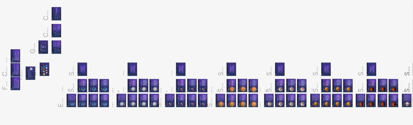
We built out 97 unique Figma frames to simulate the entire OrbitEd experience, including:
Home screen
Planet selection screen
Individual planet fact sheets
Quiz modals
Navigation bar linking to planets, moons, and stars
Feedback and score screens
Information about the site
⚙️ Components
Developed a shared component library for key UI elements such as navigation bars, planet info cards, quiz buttons, and progress indicators.
Created reusable planet visuals and icons in Adobe XD to ensure consistency and efficient asset management.
Leveraged components to quickly apply updates across the prototype, maintaining a cohesive look and feel.
Streamlined collaboration by enabling team members to work within a unified design system, reducing redundant work.
Focused on building scalable, modular elements to support future expansion of the OrbitEd platform.
Sideways view of some of our frames ↑
🕹️ Functional Demo: Planet Matching Game
While the core app was prototyped in Figma, I built one fully functional mini-game in HTML/CSS/JS: a planet-name matching quiz. This helped bring the prototype to life and demonstrate interactivity to the judges.
Players matched names to planets and received instant feedback (✅/❌), addressing the fast-feedback preference that came up in our research. It acted as a working proof of our educational model and UI logic.
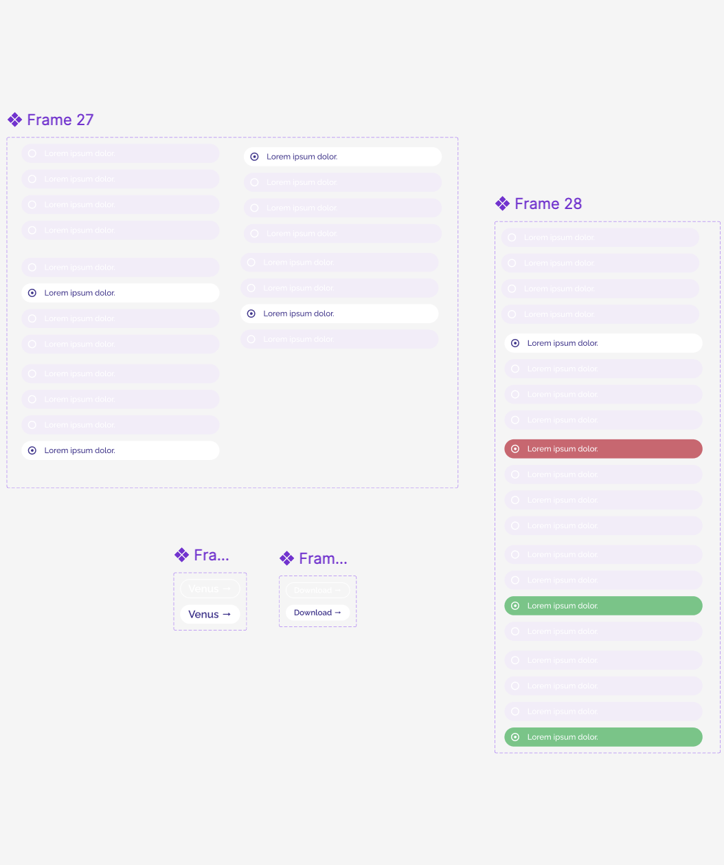
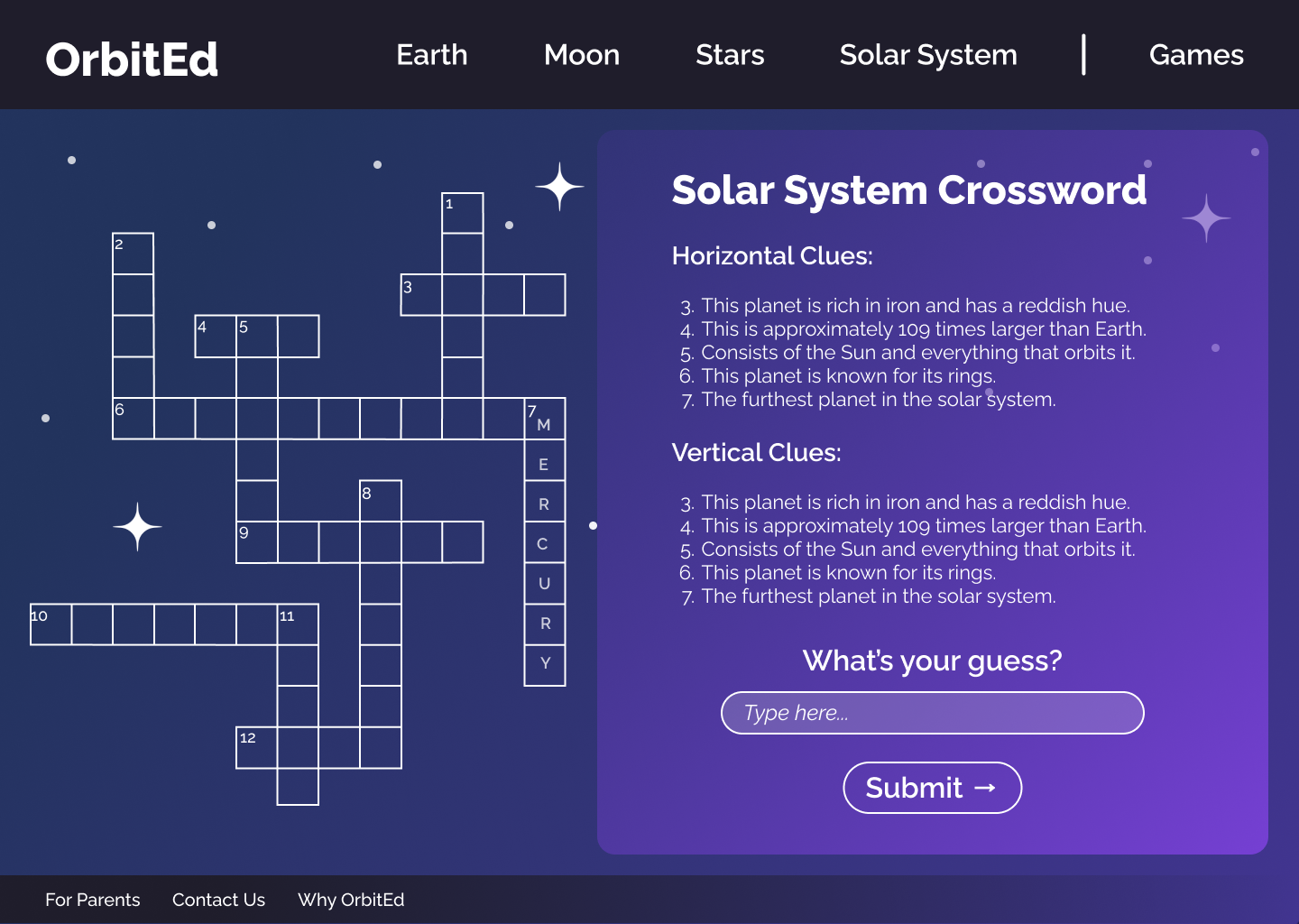
✅ Knowledge & Quizzes
Each planet in OrbitEd features an individual information frame, where students can read fun, digestible facts about that planet’s size, atmosphere, surface, and orbit. After reviewing the content, they can test their understanding through short quizzes. These quizzes offer instant visual feedback - green checkmarks appear for correct answers, while incorrect answers are marked with a red “X”, helping reinforce learning in a clear and encouraging way.
📈 Metrics of Success
📊 In the Hackathon:
Finalist Recognition: Reached the top tier of projects
Demo Engagement: All testers voluntarily tried at least one extra quiz
Prototype Scope: 97 Figma frames and full user paths in under 9 hours
Judges’ Feedback: “Mostly polished, visually strong, and highly applicable in real classrooms.”

💡 Lessons Learned
Always double-check slides for incomplete content before submission - even placeholder text can affect perception.
Map every clickable element and test prototype paths to ensure all navigation flows logically.
Allocate time for a full-team review of all materials before submission to catch inconsistencies.
Focus on presenting 2–3 polished, complete flows rather than spreading thin across many partially finished ideas.
Assign someone to manage cohesion between slides, prototype, and verbal pitch.
Budget time for a live walkthrough practice to ensure everything important can be shown within the pitch limit.


🔭 Next Steps
Expand quizzes to be longer and have more coverage of different space phenomenon
Conduct usability testing with a 6th grade class
Develop progress tracking features for teachers and homeschoolers
Partner with educators for content validation and curriculum mapping